%201%20(1).png)
Best Contractor Websites: Balancing Branding and Conversion Design
Branding and conversion design, pulled apart on real builder and remodeler sites, and why the best contractor websites need both.
.png)
Most "best contractor websites" lists are screenshots with adjectives. Clean design. Modern feel. Great photography.
The more useful question is why some contractor sites turn visitors into booked consultations and others don't. After pulling apart a lot of remodeler and builder websites, my answer is that the best ones get two things right at the same time: distinctive branding and conversion design. Most sites do one reasonably well. Very few do both.
One note before we start: websites change constantly. Everything below reflects what these sites were doing when I reviewed them. The principles hold even if a layout gets updated next month.
What makes a contractor website "good"?
A good contractor website turns a homeowner researching a $25,000–$100,000 project into a booked consultation. To do that, it has to win on two fronts.
Conversion design: answering "can I trust you?" fast
A homeowner decides within seconds whether to keep reading or hit the back button. Conversion design is everything that answers their questions before they leave:
- Trust signals up front. Years in business, projects completed, awards, certifications, visible without scrolling.
- Third-party reviews. Ratings from Google or Trustpilot carry more weight than testimonials a company picks for itself, because the homeowner knows they can't be curated.
- A clearly outlined process. What happens after they reach out, step by step, so there's no mystery about what they're signing up for.
- Easy filtering. A way to jump straight to their project type or location in a click or two, instead of scrolling through work that isn't relevant to them.
- Clear, consistent calls to action. One obvious next step, labeled honestly, visible from every page.
Get these wrong and visitors bounce before they ever see your best work.
Branding: why they'd choose you over the next contractor
Conversion design earns trust. Branding earns preference. It's the color palette, logo, typography, photography, and voice that make a company feel like a specific set of people rather than a faceless firm.
This matters more in remodeling than in most industries. You're asking someone to let a team into their home for weeks or months. A site that feels warm and personal says "these are people you'd be comfortable with." A site that feels generic or corporate, even a credible one, puts distance between the homeowner and the company at exactly the moment you want them to feel connected.
Here's how that plays out on two real sites, each strong in a different way.
1. Neil Kelly: excellent conversion design, corporate feel
Neil Kelly is a design-build remodeler serving Portland, Seattle, Eugene, and Bend. On conversion design, it's one of the strongest remodeling sites I've seen.
What it does well:
- Trust signals, repeated everywhere. "80 years," "30,000+ projects," and "4.6/5 from 2,200+ homeowners" show up across the site, not just on an About page. By the time a visitor reaches the booking page, the "can I trust you?" question has been answered several times over.
- A process that removes the mystery. Their consultation page lays out three numbered steps: book a time, take a 15-minute call with a coordinator (described as "a conversation, not a sales call"), then get matched with a designer.
- Fast filtering. Projects are organized by type (kitchens, bathrooms, additions, whole house) and by location, so a homeowner can find work like theirs in two clicks.
- Free resources that do pre-sales work. Cost calculators, a downloadable remodeling workbook, and free workshops give hesitant visitors a lower-commitment way in.
- Transparency treated as trust content. Pricing and warranty pages sit in the main navigation, not in the fine print.
Where it falls short: the site feels big-box corporate. The structure is excellent, but the overall impression is polished and institutional rather than personal. For a company asking to work inside someone's home, that can read as sterile. You trust Neil Kelly quickly; you don't necessarily feel connected to them.
The takeaway: This is the benchmark for answering "can I trust you?" fast. Borrow the structure, but don't let the structure become the personality.
2. Southtide Construction: excellent branding, weaker conversion design
Southtide Construction is a custom home builder and remodeler in Sarasota, Florida. Where Neil Kelly wins on structure, Southtide wins on feel.
What it does well:
- Branding rooted in place. The color palette, logo, and typography feel specifically like coastal South Florida: warm, relaxed, local. Even the floor plans are named after nearby islands and keys (Captiva, Gasparilla, Anna Maria). It reads like a company from the community, not a regional chain.
- Warm, personal imagery. The photography and color palette work together to help homeowners picture their own space differently, not just admire someone else's.
- A process with a name. Their "TIDE" process (Talk, Imagine, Design, Execute) turns a vague, intimidating decision into a journey a homeowner can remember and feel oriented by.
- Testimonials with a real person in them. A review that says "John was absolutely amazing" puts a name behind the promise, which reinforces the personal feel.
Where it falls short:
- Inconsistent calls to action. "Get a Free Quote" and "Schedule a Design Consultation" both lead to the same consultation page. Two labels for one action creates small moments of confusion about what the visitor is actually signing up for.
- Trust signals arrive late. The Google reviews and testimonials are there, but further down the page. A visitor asking "can I trust you?" in the first few seconds doesn't get an immediate answer.
- No quick filtering. There's no fast way to narrow projects by type or area the way Neil Kelly offers. A homeowner looking for a kitchen remodel has to dig.
The takeaway: Southtide makes you want to work with them. It just doesn't make it quite as easy to confirm you should, and some visitors will leave before the branding has a chance to win them over.
Why you need both
Put these two sites side by side and the lesson is clear: they're each missing what the other does best.
- Conversion design without branding answers "can I trust you?" but not "why you?" Homeowners trust you, compare you with three other credible remodelers, and choose on price or gut feel.
- Branding without conversion design makes a great first impression, then loses visitors who can't quickly find proof, reviews, or relevant projects. They bounce before the brand can do its job.
The best contractor website combines them: Neil Kelly's structure (trust signals, third-party reviews, a clear process, fast filtering, consistent CTAs) wrapped in Southtide's warmth (a brand that feels personal, local, and specific to the people behind it).
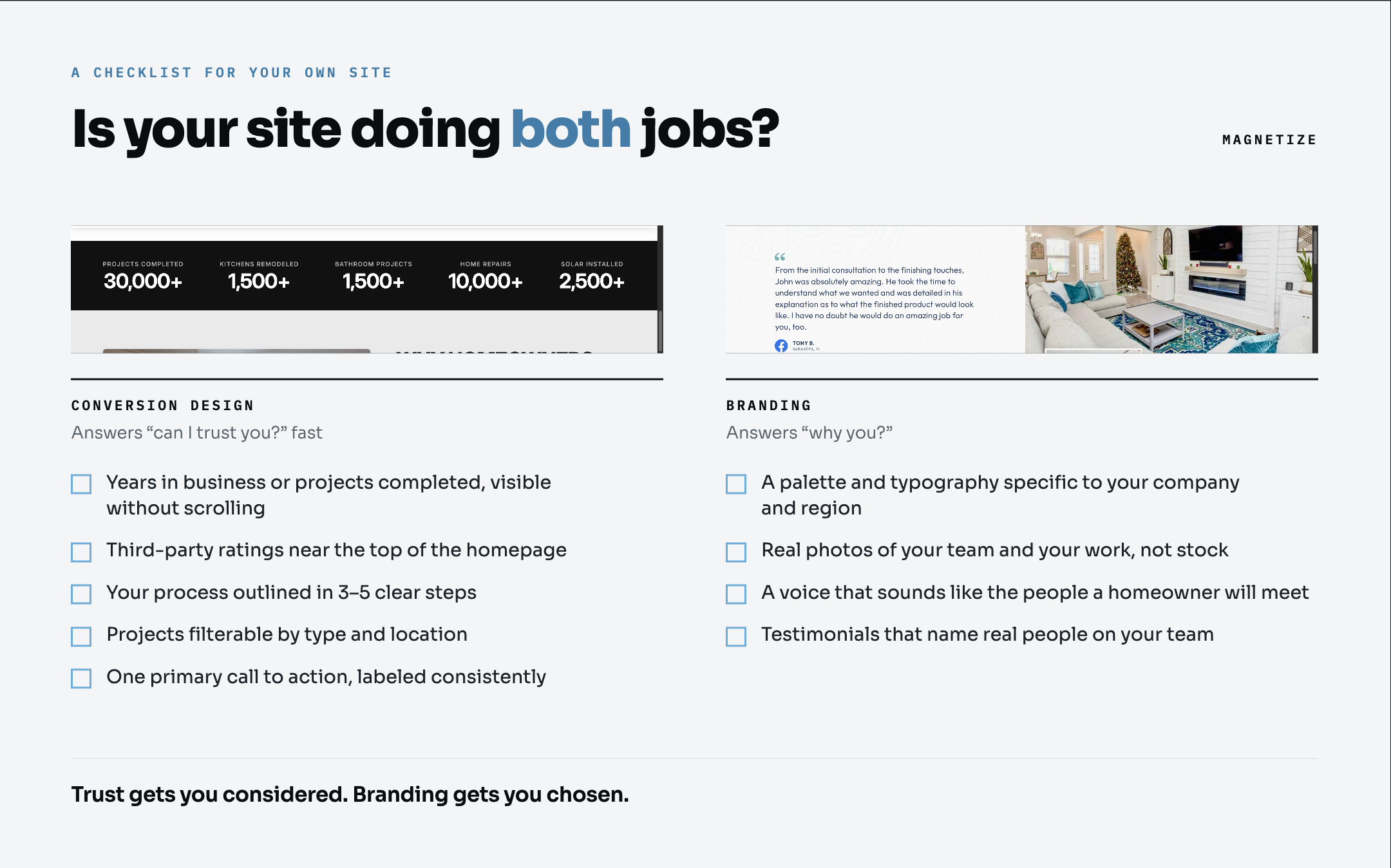
A checklist for your own site
Conversion design
- Years in business, projects completed, or awards visible without scrolling
- Third-party ratings (Google, Trustpilot) near the top of the homepage
- Your process outlined in 3–5 clear steps
- Projects filterable by type and, if you serve several areas, by location
- One primary call to action, labeled consistently everywhere
Branding
- A color palette and typography that feel specific to your company and region
- Real photos of your team and your work, not stock
- A voice that sounds like the people a homeowner will actually meet
- Testimonials that name real people on your team
Common mistakes on contractor websites
For contrast, here's what I see most often on sites that don't convert. I covered a few of these in more detail in my audit of a local contractor's website:
- A template brand. Stock photos, a generic logo, and copy that could belong to any contractor in any city.
- Reviews live everywhere except the website. Five stars on Google, and none of it on the homepage.
- Two buttons for one action, or a CTA that leads somewhere unexpected.
- A portfolio sorted by date instead of by room or project type.
- No service area, or one buried in the footer.
FAQ
What should a contractor website include?
At minimum: clear services, a project gallery organized by room or project type, third-party reviews, an explicit service area, an outlined process, and a consistent path to booking. On top of that, it needs branding that makes the company feel like specific, approachable people.
Does branding really matter for contractor websites?
Yes. Trust signals get a homeowner to take you seriously, but most of your competitors can show reviews and years in business too. Branding is what makes a homeowner remember you and feel comfortable inviting your team into their home.
Why do third-party reviews matter more than testimonials?
Homeowners know a company chooses which testimonials to display. Ratings on Google or Trustpilot can't be curated the same way, so they answer "can I trust you?" more convincingly.
How can a contractor website reduce bounce rate?
Answer the homeowner's first questions immediately: who you are, whether you can be trusted, whether you do their type of project, and how to start. Trust signals near the top, fast filtering to relevant projects, and one clear call to action do most of that work.
Is your website doing its job?
If you run a remodeling or building company and you're not sure whether your site is helping or quietly costing you leads, I'm happy to take a look. Thirty minutes, and you'll leave knowing exactly what to fix first, whether or not you hire me.
Thirty minutes, and you leave with the order your proof should land in — whether or not you hire me.
Book a strategy call